
Output across a Range of End Devices
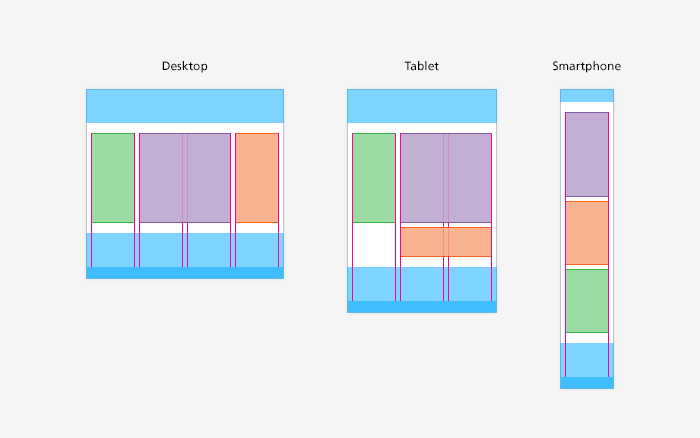
The Confederation Web Guidelines facilitate optimized output of all the content on a website on various end devices such as desktop computers, laptops, tablets, and smartphones. The layout of the individual web pages and the individual elements adapts on the fly to the viewing environment of the output device.
Desktop Computers, Laptops, and Tablets
For desktop computers, laptops, and tablets held in landscape mode, the original layout is retained. As soon as a tablet is held in portrait mode, the content of the right-hand column (the context pane) is shown below the content.
Mobile Devices / Smartphones
If the page is displayed on a smartphone, only the content is shown. The navigation function in the left sidebar disappears, as does the context pane. Instead, the user can navigate via links in the footer and a special menu for mobile devices.
Usability tests have shown that many smartphone users ignore the navigation menu in the header and navigate via links in the footer. It is therefore important to reproduce the navigation in the footer.